Geopolitical Relations Map
Click any country to see how the rest of the world relates to it. Blue means friendly, red means hostile, and the intensity shows how strong the relationship is. Over 20,000 country pairs scored across six dimensions of international relations.
What does the world look like from Russia's perspective? From India's? From a small nation like Armenia or Kosovo? This map answers that question for all 203 countries. Select a country and the entire map recolors to show its diplomatic fingerprint: which nations are allies, which are adversaries, and which fall somewhere in between.
The real depth comes from switching dimensions. Military alliances don't always match diplomatic ties. Countries with deep trade relationships can be political rivals. Regime-level alignment often cuts across geography in surprising ways. Use the Dimension button to switch between military, diplomatic, regime, societal, and economic views and see how each lens reshapes the map.
Six Dimensions of International Relations
Every relationship on this map is scored across six independent dimensions. The default Weighted view blends all six, but selecting a single dimension often reveals patterns the blended view obscures.
- Military — defense treaties, arms sales, joint exercises, basing agreements. Shows who would actually fight alongside whom.
- Diplomatic — embassy networks, treaty membership, UN voting alignment, formal state-to-state engagement.
- Regime Relations — ideological compatibility between governments. Democracies cluster, authoritarian states cluster, and the map shows the fault lines.
- Societal — cultural affinity, diaspora connections, tourism, shared language and religion. Often the most surprising dimension.
- Trade — import/export volume and supply chain dependency. Reveals economic relationships that cross political divides.
- Economic Policy — free trade agreements, sanctions, tariffs, and regulatory alignment.
How to Read the Map
- Strong allies (Dark Blue): close relationship across the selected dimension
- Leaning friendly (Light Blue): positive but moderate ties
- Neutral (Gray): minimal relationship or balanced tensions
- Leaning hostile (Light Red): friction or rivalry
- Strong adversaries (Dark Red): deep hostility or active opposition
Click any country on the map or use Search to select it. Use Quick Access to jump to geopolitically contested nations like Palestine, Taiwan, and Kosovo.
Notable Countries to Explore
- United States: the world's dominant diplomatic network. Strong blue across NATO and the Pacific, but the map reveals where US influence fades and rivals fill the gap.
- China: the world's second diplomatic network, anchored by a deepening partnership with Russia and strong military ties with Pakistan (68) and North Korea (60). But the real story is economic reach: switch to the trade dimension and China lights up blue across Africa, Southeast Asia, and even some US-allied nations, revealing the tension between security alliances and trade dependencies.
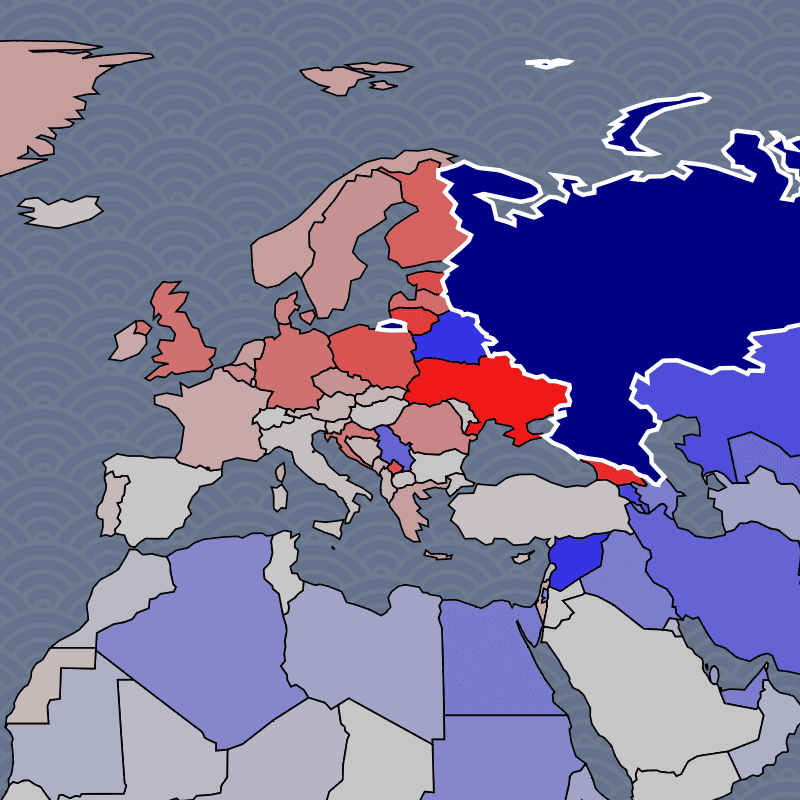
- Russia: isolated from the West since 2022, but the map shows its deepening axis with China (its strongest diplomatic relationship at 73) and a wartime military bond with North Korea (92 military score). Belarus functions as a garrison state. Switch to the societal dimension to see cultural ties with former Soviet states that persist despite political rupture.
- India: the world's most complex balancing act. Deepening defense ties with the US through the Quad, importing discounted Russian oil and arms (48 military score with Russia), competing with China on their shared border, and culturally tied to the UK through diaspora. Every dimension tells a genuinely different story.
- Israel: strong Western military backing meets near-universal opposition from the Muslim world. One of the starkest blue-red splits on the map, and one of the most polarizing diplomatic profiles globally.
- Iran: in crisis after losing its Syrian and Lebanese proxies, but far from alone. Russia's military score jumped to 65 post-2022, and China's economic lifeline (73 trade score) keeps the regime funded. The map shows Iran's remaining network: weakened but concentrated among partners with their own reasons to resist Western pressure.
- Taiwan: a test case for the gap between diplomatic recognition and real-world support. Few countries formally recognize Taiwan, but military and societal dimensions paint a very different picture.
- Palestine: recognized by over 140 UN member states, yet the map shows how diplomatic recognition diverges sharply from military support. Switch to the military dimension to see the contrast.
- North Korea: no longer just a Chinese client state. The wartime pivot toward Russia shows up as a 92 military score, reflecting arms-for-support deals that have reshaped Northeast Asian dynamics. China remains the economic lifeline, but the military dimension now tells a different story than it did two years ago.
- Turkey: a NATO member that maintains close ties with Russia, buys Chinese defense systems, and mediates Middle Eastern conflicts. The dimension selector reveals how Turkey straddles multiple alliance networks.
These are starting points. Every country has a unique diplomatic fingerprint worth exploring.
How the Data Works
Every country pair is evaluated by the latest AI models across all six dimensions. Each pair is scored multiple times with different prompts and temperature settings, and news-grounded runs use real-time web search to capture recent developments like sanctions, treaties, or military deployments. The results are averaged to reduce bias and hallucination.
This approach captures the full picture of how two countries relate better than any single data source. UN voting records miss military realities. Trade data misses ideological alignment. Embassy counts miss cultural ties. The multi-dimensional AI scoring synthesizes all of these signals into a single, comparable framework across 20,000+ country pairs.
Frequently Asked Questions
- What is a geopolitical map?
- A geopolitical map visualizes the political relationships between countries, going beyond physical borders to show alliances, rivalries, and spheres of influence. This map scores every country pair across military, diplomatic, economic, and societal dimensions, then colors the world based on how each nation relates to a selected country.
- What do the different dimensions show?
- Each dimension captures a different aspect of how countries relate. Military shows defense cooperation and arms trade. Diplomatic shows formal state-to-state engagement. Regime Relations shows ideological alignment between governments. Societal shows people-to-people ties like diaspora and cultural exchange. The two economic dimensions cover trade volume and policy alignment (tariffs, sanctions, trade deals). Switching dimensions often reveals that a country's military allies are not the same as its economic partners.
- Who are Russia's closest allies?
- Select Russia on the map to see. Belarus is the closest ally across every dimension, functioning as a military garrison state. China is Russia's most important strategic partner, with the highest diplomatic score (73) and deepening military ties. North Korea has emerged as a key wartime military partner (92 military score), supplying arms in exchange for technology. Switch to the societal dimension and former Soviet states like Kazakhstan light up, showing cultural bonds that persist despite political divergence.
- Who are China's closest allies?
- China's alliance network depends heavily on which dimension you examine. Russia is the top strategic partner (73 diplomatic, 67 military), followed by Pakistan (68 military, 88 regime) and North Korea (60 military, 76 regime). But the trade dimension tells a different story: China's economic relationships extend across Africa, Southeast Asia, and even to countries that are politically hostile, like many US allies with deep supply chain dependencies on Chinese manufacturing.
- How many countries are included?
- The map covers 203 countries and territories, including disputed entities like Taiwan, Palestine, and Kosovo. Each is scored against every other country, producing over 20,000 scored relationships per dimension. Regional overlays for organizations like the EU and ASEAN are available separately.
- How accurate is AI-scored diplomatic data?
- Each country pair is scored multiple times across different model runs and temperature settings, with some runs using real-time web search to incorporate recent events. The scores are then averaged. While no single score is perfect, the aggregation reduces individual errors and captures the overall direction of relationships. The multi-dimensional approach is more comprehensive than relying on any single indicator like UN votes or trade statistics.
- How often is the data updated?
- The relationship scores are periodically rescored with news-grounded AI runs that use real-time web search. This means major geopolitical shifts, like new sanctions, military deployments, or diplomatic breakthroughs, are reflected in subsequent scoring rounds without needing to rescore all 20,000+ pairs from scratch.
- Can I compare how two countries see the world differently?
- Yes. Click one country, note the pattern, then click another. The map recolors instantly. For a more structured comparison, use the Conflict page to place two countries on opposite sides and see which nations would align with each. Or explore the country detail pages, which include AI-generated diplomatic summaries.